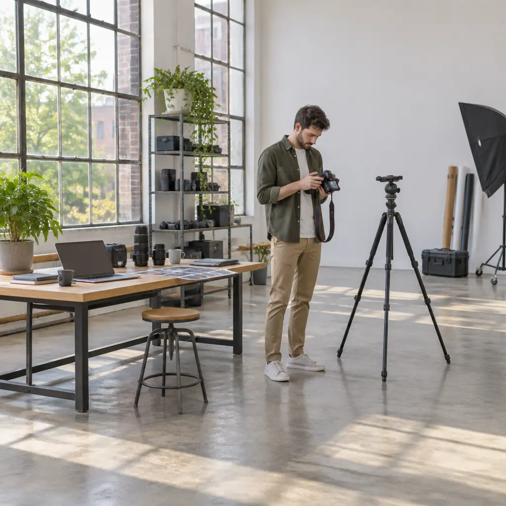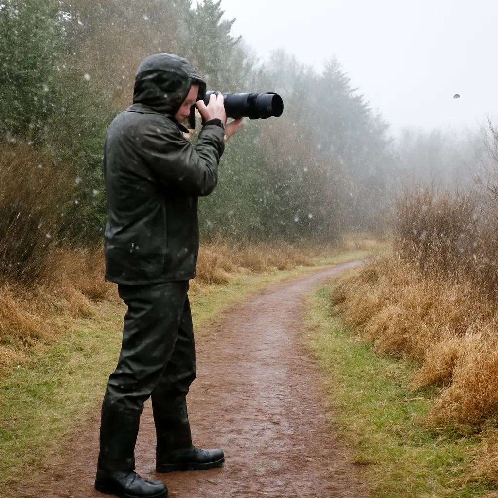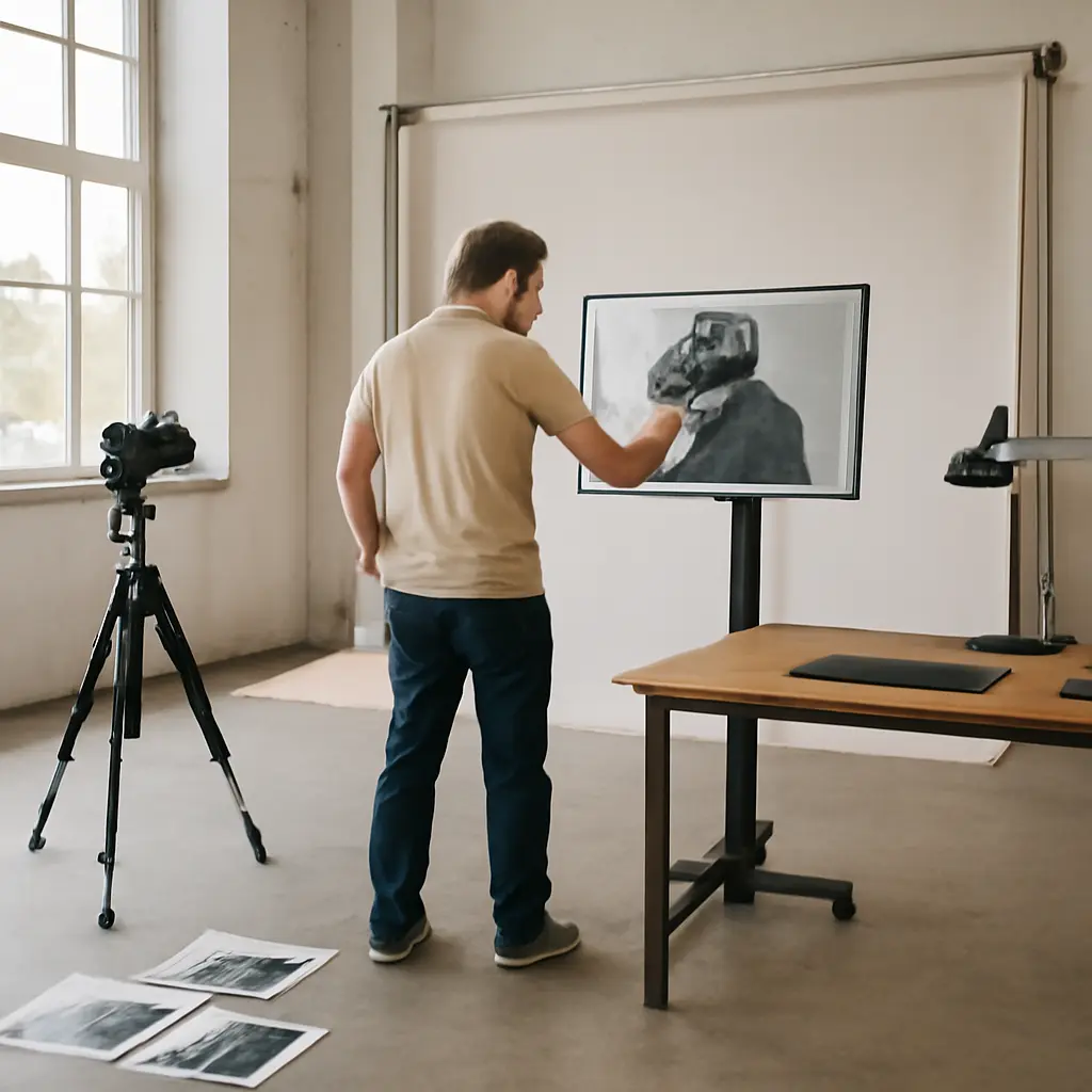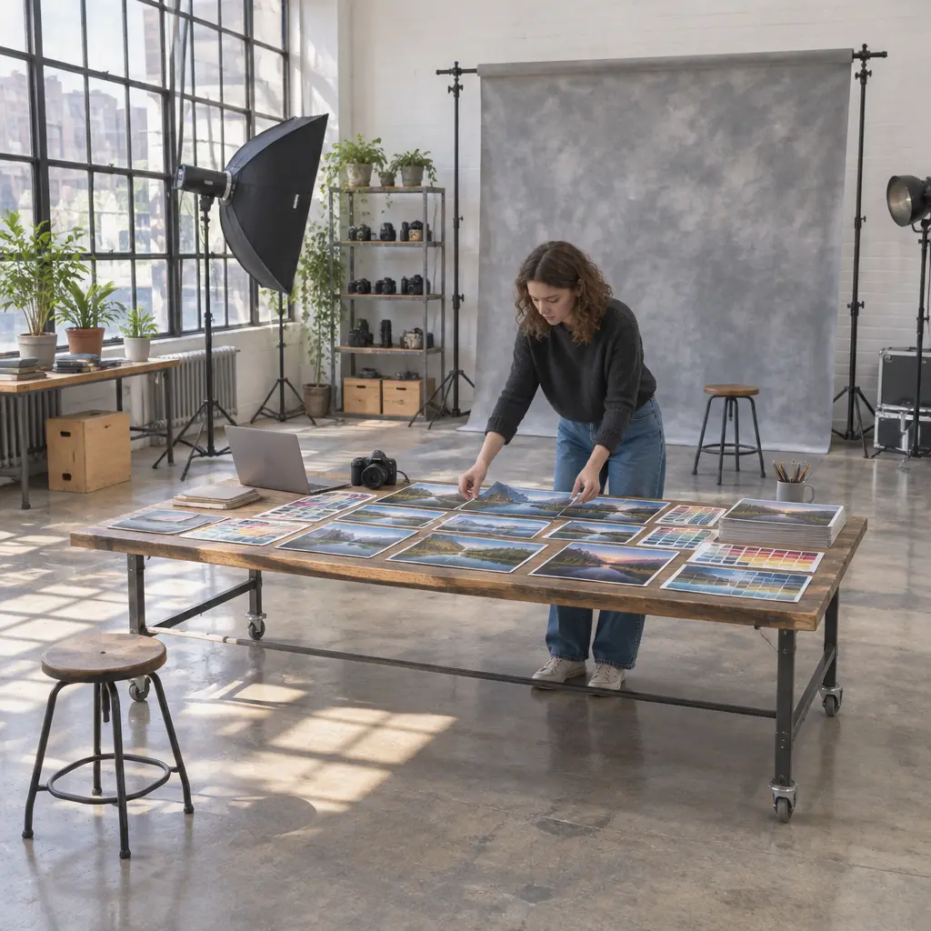
A photography mood board is a curated collection of visual references that helps turn a broad idea—such as “quiet,” “cinematic,” or “sunlit”—into a more consistent photographic style. Built from images, color palettes, lighting examples, locations, and notes, it can guide decisions before and during a shoot. Its value is practical: Adobe’s 2024 Creative Trends research identifies visual inspiration and evolving aesthetic preferences as important parts of creative work, while a mood board gives photographers a focused way to collect and apply those references. This guide explains what a photography mood board is, how to build one, which visual categories to include, and how to use it without simply copying another photographer.
Defines Photography Mood Board Structure and Purpose
A photography mood board is a deliberately selected set of visual and written references that communicates the intended look, feeling, and creative direction of a shoot or body of work. Design education sources such as Canva describe mood boards as collages that help express a concept through images, colors, textures, and typography. For photographers, the central attribute is not the number of pictures collected but how clearly the collection translates an idea into choices about light, color, composition, subject, and setting.
A board can support a single portrait session, a commercial campaign, a personal project, or a longer-term portfolio direction. It is most useful when it answers practical questions: What should the light feel like? Which colors recur? How close is the camera to the subject? Does the image feel candid, polished, dramatic, or restrained? Treat the board as a decision-making tool, not a rigid recipe.
Concept and emotional direction
The concept is the short statement that holds the board together. It may describe a subject, a story, or an emotion—for example, “a relaxed summer portrait with soft shadows and nostalgic color.” Naming the intended feeling before collecting references helps distinguish relevant images from attractive but unrelated ones. A useful board usually has one primary concept and a small number of supporting ideas.
References and visual evidence
References are examples that demonstrate a particular visual quality, such as side lighting, muted greens, wide framing, or motion blur. They need not all be photographs: a film still, painting, fabric sample, architecture detail, or landscape can communicate color and texture. Add a short note explaining what each reference contributes. This helps prevent a collection from becoming a pile of images with no shared direction.
Practical boundaries and originality
A strong board establishes direction while leaving room for discovery. Identify what to borrow—such as a lighting quality or palette—and what not to reproduce, such as another photographer’s exact pose, framing, or distinctive image. For client work, confirm the intended audience, deliverables, location limits, and usage rights before production. Reference images are creative guidance, not permission to reuse copyrighted photographs.
Builds Photography Mood Board Style from Visual Attributes
Photography style emerges from recurring choices rather than a single preset or camera. A mood board makes those choices visible by grouping references according to attributes such as lighting, color, composition, texture, and subject treatment. These categories are related: a warm palette may reinforce a nostalgic mood, while hard light and centered framing may create a more graphic effect. Reviewing them together reveals whether the proposed style is coherent.
Color palette and tonal range
A color palette is the set of hues and tonal relationships that recur across the intended images. Include a few dominant colors, supporting neutrals, and examples of how bright or subdued the overall image should be. Adobe Color provides tools for exploring color relationships, but the board should also show how colors behave in actual photographs: skin tones, backgrounds, clothing, and highlights can shift the impression of a palette. Note whether contrast should be crisp or gentle and whether shadows should retain detail or appear deep.
Lighting and atmosphere
Lighting describes the direction, softness, intensity, and color of the light. A board might specify window light, open shade, direct midday sun, flash, or a low-key studio setup. Include references that show both the light source’s effect on the subject and the resulting shadow pattern. The National Geographic photography education materials emphasize that light changes a photograph’s mood and form; translating that idea into a board makes lighting choices easier to discuss with collaborators.
Composition, perspective, and motion
Composition is the arrangement of subjects and visual elements within the frame. Collect examples of distance, camera height, negative space, symmetry, cropping, and depth of field. Add movement references when the project calls for stillness, gesture, blur, or action. To make the board actionable, label the visual effect rather than prescribing every shot—for instance, “environmental portrait with generous space above the subject” is more flexible than demanding an identical frame.
Texture, setting, and subject treatment
Texture and setting give a visual style its material character. References might show grain, reflective surfaces, weathered walls, soft fabric, foliage, or a particular landscape. Subject treatment includes wardrobe, posing, expression, styling, and the relationship between people and their surroundings. Keep these elements connected to the concept: a polished fashion direction may call for controlled posing and clean surfaces, whereas a documentary-inspired portrait may benefit from natural gestures and lived-in locations.
Organizes Photography Mood Board Research and Workflow
Once the visual attributes are clear, the next task is to gather and organize references efficiently. The process works whether the board is physical or digital. Pinterest, Milanote, Canva, and presentation software can all hold references; the best format is the one that allows the photographer and collaborators to scan the direction quickly and make updates.
Collects references with a focused search
Start with a concept statement and search for specific visual evidence rather than a broad style label alone. Search terms such as “soft side-lit portrait,” “overcast coastal color palette,” or “wide environmental fashion portrait” are more informative than “beautiful photography.” Save the source and creator information alongside each reference. This supports attribution, makes later review easier, and helps distinguish inspiration from images that can legally be used in a campaign or publication.
Edits the board for coherence
A board becomes useful through selection. Remove images that do not support the concept, even if they are appealing on their own. Look for repeated visual signals and check for contradictions: several references may suggest soft natural light while one isolated image implies harsh flash. Contrasts can be intentional, but label them as alternatives or distinct scenes. A concise board is generally easier to use than an exhaustive archive.
Turns inspiration into a shoot plan
Translate the final board into a practical checklist covering location, timing, equipment, wardrobe, props, lighting, and a short shot list. For outdoor work, check weather and the direction of available light; for studio work, note the intended modifier and setup. A simple chart can link each visual goal to a production choice:
- Visual goal: soft, intimate portrait; production choice: large diffused source close to the subject.
- Visual goal: warm, late-day atmosphere; production choice: schedule near golden hour and manage mixed color temperatures.
- Visual goal: graphic, high-contrast frame; production choice: use direct or narrowly controlled light and simplify the background.
Reviews and refines after the shoot
Compare the finished images with the board after the shoot, not to judge every deviation as a failure but to identify what worked. Note which lighting choices, locations, and compositions produced the intended feeling. Over time, keep a separate collection of successful images from your own work. That personal archive can reveal recurring preferences and help a mood board evolve into a recognizable style rather than a temporary imitation.
Applies Photography Mood Board Style to Real Projects
The same method adapts to different genres because each project needs a different balance of mood and operational detail. A wedding photographer may prioritize changing light and candid emotion; a product photographer may specify controlled reflections, surface color, and consistent framing. The board should therefore reflect the project’s purpose, audience, and constraints.
Portrait and fashion photography
For portraits and fashion, include references for expression, pose, wardrobe, background, and how much of the environment appears in the frame. A client-facing board can also show distinct options—such as natural and editorial directions—so expectations are clear before the session. Keep representation and comfort in view: communicate posing intentions, invite subject input, and avoid treating reference images as a standard every person must match.
Product and food photography
Product and food boards often need more technical specificity. Show surface materials, shadow density, reflections, prop scale, camera angle, and the balance between product detail and atmosphere. For a consistent catalog, prioritize repeatable lighting and framing; for editorial work, allow more variation in styling and scene. Include a reference for the intended final crop so that essential details remain visible across formats.
Documentary and personal projects
Documentary and personal projects can use a mood board to clarify tone without scripting real events. References may describe distance, available light, color treatment, or the visual boundaries of a series. In documentary contexts, accuracy, dignity, and subject safety should take precedence over aesthetic consistency. A board can guide the photographer’s attention, but it should not encourage staging that misrepresents the story.
Conclusion: Uses Photography Mood Boards to Define a Durable Style
A photography mood board turns an abstract creative intention into visible choices about concept, color, light, composition, texture, and subject treatment. Its strongest form is focused, clearly annotated, practical for production, and flexible enough to support unexpected moments. Use references responsibly, translate them into a shoot plan, and review the results against your own creative aims. To begin, write one sentence describing the feeling you want your photographs to convey, then collect and edit references that help you achieve it.
Sources: Canva, “What Is a Mood Board? How to Create One,” https://www.canva.com/learn/mood-boards/; Adobe, “Adobe Creative Trends,” https://www.adobe.com/creativecloud/design/discover/creative-trends.html; Adobe Color, “Create Color Palettes,” https://color.adobe.com/create/color-wheel; National Geographic, “Photography,” https://www.nationalgeographic.com/photography/