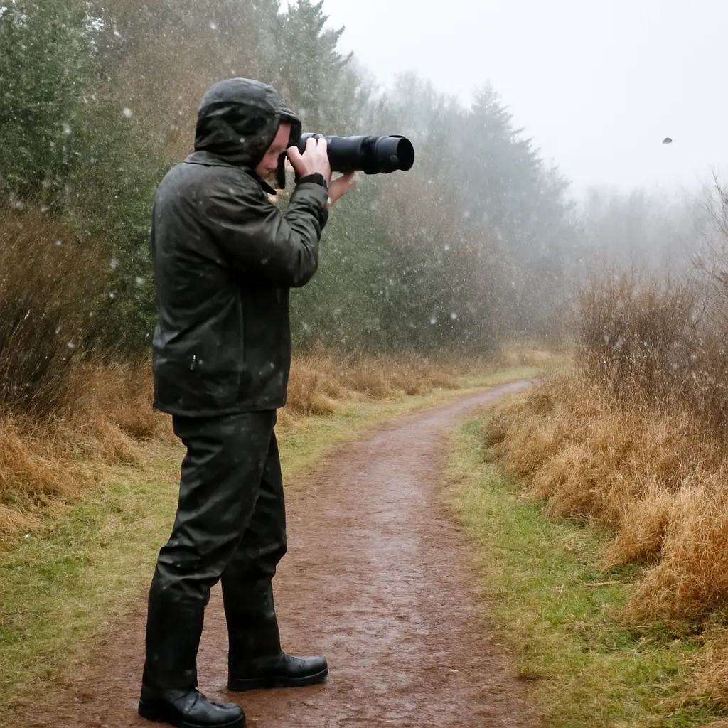
Monochrome photography creates drama by reducing an image to tonal contrast: bright areas, deep shadows, and the gradations between them. Rather than relying on color to separate subjects or set a mood, black-and-white images use light, composition, texture, and photographic technique to guide attention. The approach has a long history, but it remains relevant in contemporary photography: this article explains how tonal range works, how shadow and light shape mood, how photographers control contrast, and how notable examples demonstrate monochrome’s expressive power.
Monochrome photography uses tonal contrast to create drama
Monochrome photography represents a scene using one hue or a range of tones rather than a full spectrum of colors. Black-and-white photography is its best-known form, though monochrome images may also be tinted or toned. In the context of dramatic photography, the essential pairing is tonal contrast and visual emphasis: differences between light and dark make forms, textures, and focal points easier to read.
The approach matters because it changes how viewers interpret a scene. Without color distinctions, attention shifts toward luminance, edges, texture, gesture, and composition. There is no single statistic that measures how dramatic an image is; the effect depends on subject, viewing conditions, and artistic intent. But the technical foundation is measurable: the Zone System, developed by Ansel Adams and Fred Archer in the 1930s, organizes brightness into eleven zones, from pure black to pure white, with middle gray at the center. This framework helps photographers plan how much detail to retain in shadows and highlights.
Tonal contrast defines monochrome’s expressive range
Tonal contrast is the difference in brightness between parts of an image. In black-and-white photography, it determines whether shapes appear distinct, whether a subject separates from its background, and whether the picture feels gentle or forceful. Ansel Adams described photographic visualization as the process of imagining the finished image before exposure, then controlling exposure and development to achieve it. His Zone System is one practical method for translating that intention into tonal values.
Tonal contrast includes several related forms: global contrast across the image, local contrast between neighboring details, and subject-background contrast that separates a focal point from its surroundings. These distinctions provide a useful bridge from the overall tonal design to the specific roles played by shadows, highlights, and midtones.
High-key imagery: drama through luminous restraint
High-key imagery is dominated by bright tones, with relatively limited deep shadow. It is not simply an overexposed photograph: highlights should retain intentional structure, and the tonal balance should suit the subject. In monochrome portraiture, high-key lighting can soften facial contours and create an open, delicate mood. In architecture or foggy landscapes, pale tones can also suggest space, quiet, or isolation.
The dramatic effect comes from selective contrast. A small dark feature—a pupil, a doorway, or a distant tree—can become striking when surrounded by bright areas. High-key images show that drama does not require pervasive darkness; it can emerge from the careful placement of a few contrasting forms.
Low-key imagery: deep shadows and concentrated attention
Low-key imagery emphasizes dark tones while reserving light for selected details. The technique is especially effective when a narrow beam of light reveals a face, hand, or object against a subdued background. By reducing visible information, shadows can create suspense, suggest depth, and direct attention toward what remains illuminated.
Deep shadows are not automatically successful. If important forms collapse into undifferentiated black, viewers may lose the subject rather than experience mystery. Photographers therefore decide which shadows should retain texture and which can become nearly pure black. This balance connects tonal design to lighting choices on set and in the field.
Midtones and local contrast: keeping detail legible
Midtones are the values between the darkest shadows and brightest highlights. They carry much of the visible detail in skin, stone, fabric, and foliage. Local contrast—the difference between adjacent tones—can make that detail appear crisp without changing the image’s overall brightness. Too little local contrast may make textures look flat, while excessive contrast can make them harsh.
The Zone System’s eleven zones offer a planning vocabulary for this range, but they are not a requirement for every workflow. Digital photographers can use a histogram to inspect the distribution of brightness values. A histogram that touches either end may indicate clipped shadows or highlights, although clipping can also be an intentional creative choice.
Directional light shapes monochrome shadows
Lighting direction determines where shadows fall, how long they appear, and which surfaces receive emphasis. In monochrome photography, these decisions become especially visible because color cannot distract from the relationship between illuminated and unlit areas. Side light reveals texture; backlight can turn subjects into silhouettes; frontal light tends to reduce visible surface relief.
A practical lighting vocabulary includes hard light, soft light, and mixed light. These categories describe the character and distribution of illumination, not simply its brightness. Understanding them helps photographers turn an ordinary subject into a purposeful tonal composition.
Hard light creates crisp edges and graphic shapes
Hard light comes from a relatively small or distant source and produces sharply defined shadows. Direct sunlight on a clear day is a common example. In black and white, hard light can emphasize wrinkles, masonry, architectural geometry, and long cast shadows. It is useful for bold, graphic compositions but can overwhelm subtle surface detail.
The angle matters as much as the source. Low-angle sunlight creates long shadows, while midday sun often produces shorter, more vertical shadows and pronounced contrast on faces. Photographers can change the effect by moving the subject, waiting for a different time of day, or introducing diffusion or fill light.
Soft light reveals gradual tonal transitions
Soft light comes from a large source relative to the subject, such as an overcast sky or a light modified with diffusion. It creates softer shadow edges and smoother transitions across surfaces. This can suit portraits, still lifes, and scenes where delicate tonal detail matters more than sharp graphic separation.
Soft light does not necessarily mean low contrast. A scene may have soft-edged shadows but still contain a large brightness difference between the subject and background. In monochrome work, separating shadow-edge softness from overall contrast gives the photographer more control over mood.
Backlight and silhouette reduce a subject to its outline
Backlight comes from behind the subject relative to the camera. When exposure is set for the bright background, the subject may become a silhouette: a dark shape whose outline carries the meaning. Silhouettes work best when the subject’s contour is recognizable and important forms do not merge into one another.
This approach demonstrates how monochrome can communicate through omission. Fine surface detail disappears, but gesture, posture, and shape become more prominent. It is a useful technique for conveying distance, scale, or tension without showing every element clearly.
Exposure and editing preserve the intended tonal range
Exposure and post-processing determine how the camera’s recorded brightness becomes the final monochrome image. A good workflow begins with an idea of which highlights and shadows need detail, then uses exposure, raw-file conversion, and local adjustments to support that plan. The transition from lighting to editing is important: processing can refine the tonal structure, but it cannot reliably restore information that was never captured.
Exposure protects important highlights and shadows
Exposure controls how much light reaches the sensor or film. Photographers commonly review a histogram or highlight warnings to identify possible clipping. If critical highlights are recorded as featureless white or important shadows as featureless black, their original texture may be unrecoverable. However, preserving every tone is not always the goal; intentional clipping can strengthen a silhouette or create a stark, high-key effect.
In digital capture, raw files generally retain more flexibility for later tonal adjustments than compressed image files. A useful practice is to expose for the most important information in the scene and check the result on the camera display, while remembering that the preview is not a substitute for the raw data.
Color filters and channel mixing change grayscale values
A monochrome conversion decides how the colors in a scene map to gray. In traditional film photography, colored filters change how different wavelengths reach the film. In digital editing, channel mixing provides a similar creative control: increasing or decreasing the contribution of red, green, or blue information changes the relative brightness of objects that had different colors.
For example, a red filter in black-and-white landscape photography can darken a blue sky relative to clouds, making cloud shapes appear more prominent. The exact result depends on the film, sensor, filter, and conversion method. This is why monochrome conversion is not merely removing color; it is a tonal interpretation of the original scene.
Dodging and burning guide the viewer’s eye
Dodging lightens selected areas, while burning darkens them. These techniques originated in darkroom printing and remain common in digital editing. Applied with restraint, they can restore emphasis to a face, deepen a distracting corner, or clarify the visual path through an image.
Local adjustments should support the scene’s light direction and structure. If edits create implausible halos or inconsistent illumination, the image may feel artificial. A useful test is to compare the edited image at both full size and thumbnail size: details should remain natural, while the overall composition should read clearly.
Photographic history shows how monochrome creates meaning
Monochrome’s expressive power is evident in the history of photography, from documentary images to carefully constructed landscapes and portraits. These examples show that high contrast is only one route to drama. Subject, timing, framing, and tonal subtlety can be equally important.
Ansel Adams and the planned landscape
Ansel Adams used the Zone System to connect visualization, exposure, and darkroom printing. His landscapes demonstrate how deep foreground shadows, detailed midtones, and bright clouds can coexist in a carefully controlled print. The lesson is not simply to maximize contrast, but to decide where detail and emphasis belong before making the photograph.
The National Park Service preserves and interprets many of the places Adams photographed, including Yosemite. His work helped establish the landscape photograph as both a record of place and a deliberate artistic construction.
Gordon Parks and expressive documentary photography
Gordon Parks used photography to document Black life in America and to address racial inequality. His monochrome images show how tonal control can reinforce a subject’s presence without reducing the photograph to a purely formal exercise. Gesture, setting, and the social circumstances of the image remain central to its meaning.
The Gordon Parks Foundation maintains an archive and exhibition program that contextualize his photographs alongside his work as a writer, filmmaker, and composer. His practice is a reminder that dramatic lighting is most powerful when it serves the story and the people represented.
Contemporary practice: deliberate conversion rather than default filters
Today, photographers may capture in color and convert later, or use a camera’s monochrome preview to compose directly in tones. Both approaches can work. A deliberate conversion gives control over how individual colors become gray, while a monochrome preview can help photographers notice shapes and contrast in the moment.
For practical results, compare several conversions of the same image, inspect important highlights and shadows, and evaluate the picture at its intended display size. A dramatic monochrome photograph does not need to be uniformly stark: a quiet tonal passage can make the strongest shadow more compelling.
Conclusion: make light and shadow serve the story
Monochrome photography creates drama by making tonal contrast, directional light, and composition carry the image’s meaning. High-key and low-key approaches offer different kinds of emphasis; hard, soft, and backlight shape the shadows; and exposure, conversion, dodging, and burning help refine the result. Historical examples from Ansel Adams and Gordon Parks show that these tools can serve landscape artistry as well as documentary storytelling.
To explore the approach, photograph the same subject in different light, make multiple grayscale conversions, and note which details remain visible in the shadows and highlights. Study prints and archival photographs, then make tonal decisions that support the subject rather than relying on contrast for its own sake.
Sources: Ansel Adams, The Print, Little, Brown and Company, 1983; Ansel Adams, The Negative, Little, Brown and Company, 1981; National Park Service, Ansel Adams, https://www.nps.gov/yose/learn/historyculture/ansel-adams.htm; Gordon Parks Foundation, Gordon Parks, https://www.gordonparksfoundation.org/gordon-parks/biography; Museum of Modern Art, Gordon Parks, https://www.moma.org/artists/4535.